The Area chart is used to represent quantitative data graphically. The graph is used to interpret the quantitative statistics graphically. The graph is based on a Line graph, and the area between the x-axis and lines are emphasized with colors, textures or hatchings.
Area charts are used to represent accumulated totals using numbers and percentages. It is also used to show the trends over time along with all related attributes.
The x-axis of the Area chart represents the grouping parameter(s), and the y-axis represents values of the aggregation parameter.
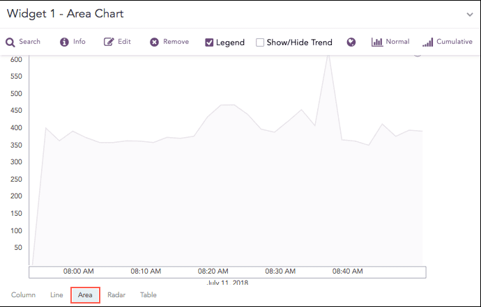
Time trend showing logs in 30 minutes
The following query gives the output shown above.
| timechart count()
The Area chart supports two aggregation response types for representation of search results in the visualization. They are:
Response Type |
General Syntax |
|---|---|
| chart aggregation_parameter by grouping_parameter1,
grouping_parameter2, ........, grouping_parametern
|
|
| timechart aggregation_parameter
|
Example:
action=* source_address=* | chart count() by action, source_address
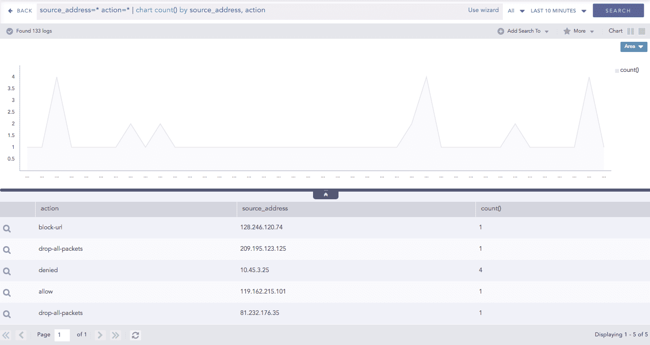
Area chart for Single Aggregation with Grouping
You can refer to Single Aggregation with Grouping for more details.
Example:
| timechart sum(datasize)
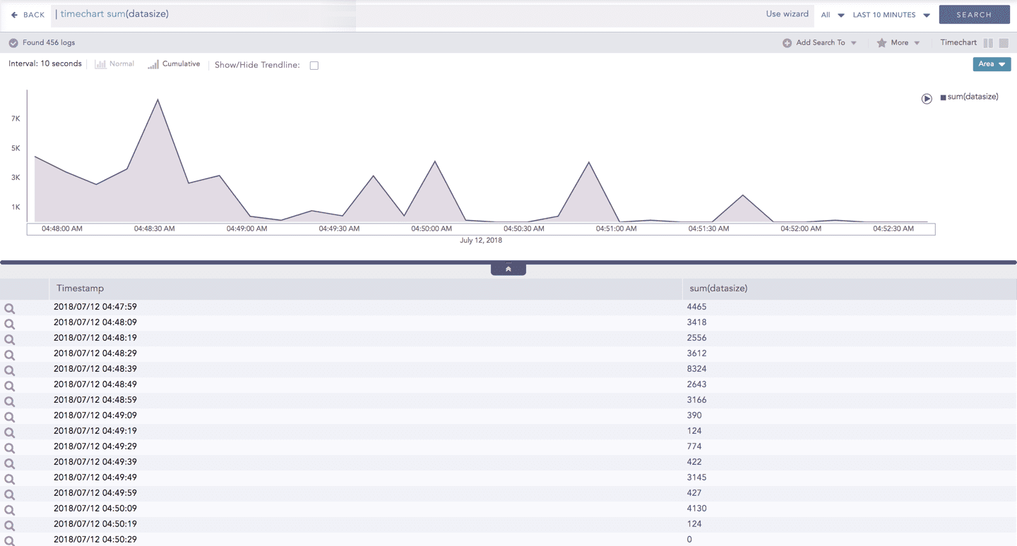
Area chart for Timechart Single Aggregation without Grouping
You can refer to Timechart Single Aggregation without Grouping for more details.